Abraxas Studio

Continuing to make
things that
don’t look like
everything else.
Since 1993.
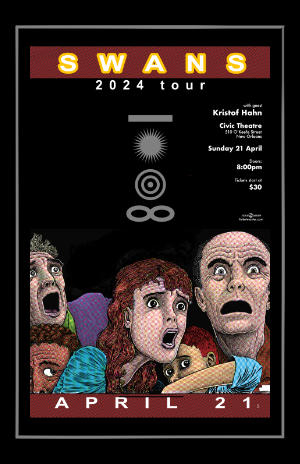
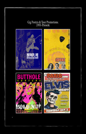
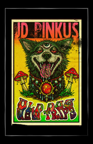
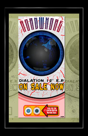
Got something that needs to look….
dangerous?
Print design. Music posters. Book covers. Vinyl packaging.
Illustration. Photography. Identity.
Built in Indiana.
Sharpened in New Orleans.
KIBU - From sketch to brand.
Strategic identity development for Kibu.
Kibu needed a visual identity that could hold its own on the street — bold enough to cut through, distinctive enough to stick. The process moved from clean typographic exploration through color development and palette building to a final mark that lands somewhere between vintage athletic and urban street culture. Layered, confident, and built to wear well.
Starting Point
Every mark begins with type. The initial exploration tests weight, proportion and personality — finding the right letterforms before any styling begins.
Color & Character
With the basic form established, color and texture enter the picture. A palette is developed alongside the type — warm, earthy tones that give the mark personality and range.
The Final Mark
The resolved logo. Bold, layered, confident — a retro-inflected wordmark with enough personality to stand alone and enough flexibility to work across applications.
Straight From the Cutting Room Floor.
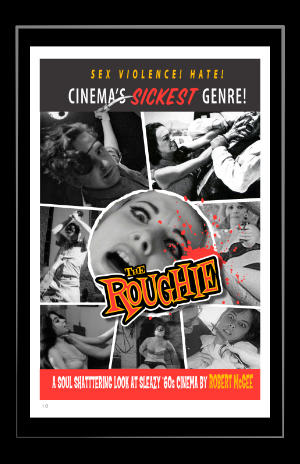
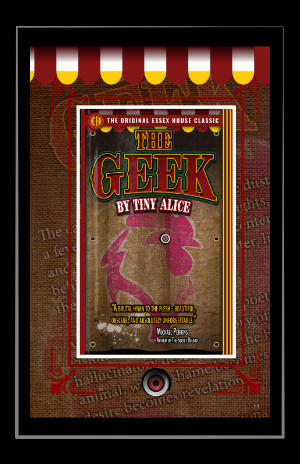
The Bedlam Files — Adam Groves
Four volumes. One obsession. The Bedlam Files is a deep dive into the strangest corners of cinema — cult movies, lost science fiction, underground film madness. The design had to match the material: raw, cinematic, and slightly unhinged.

Frame by Frame.
The cover borrows the language of the films it documents — film strip borders, lurid stills, the energy of a midnight double feature. Bold, trashy, and completely intentional.

Four Books. One Image.
Placed side by side, the spines of all four volumes reveal a single continuous image — a design decision that rewards the collector and turns a bookshelf into a statement. Crimson and gold. Loud and deliberate.

Inside the Madness.
Clean grid. Generous white space. The interior design lets the writing breathe while chapter openers hit hard — bold numerals, strong headlines, editorial photography. Serious design for seriously odd cinema.
About Abraxas.
Howard Griggs has been designing since 1993, when a borrowed PC and some gifted software started something that never really stopped.
In thirty-plus years he has run advertising departments, served as Creative Director at one of the largest tech companies in New Orleans, handled accounts for General Motors, and spent eighteen years teaching for Apple — introducing both employees and customers to the tools that changed how they how they live their lives.
Through all of it, Abraxas Studio never went away. It couldn't. The design work — the music posters, the book covers, the vinyl packaging, the identity systems — that's not a side project. It's the thing.
He runs New Essex House, a publishing imprint dedicated to making transgressive and hard-to-find books available again. He makes posters for bands he believes in. He builds brands for people who want something with an actual point of view.
Available for freelance and remote work. No corporate polish. No generic solutions. Just thirty years of knowing what good looks like and how to build it.
Let’s talk.
©2025 HGriggs — Abraxas Studio — New Orleans.